B L O G
beautifying, loving, organizing & good things
for your home & life
for your home & life
|
|
|
 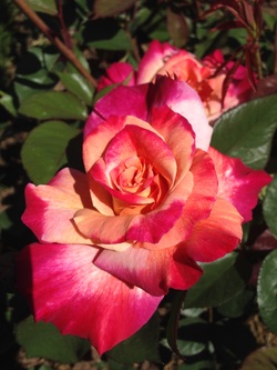 I propose a new attitude towards our interiors. Here’s a test for you: When you walk into a room, what is your instinctual response to the color on the wall? Be honest, now. Does the colors in the room make your soul sing, or are the colors “safe”. If you have boring beige, my favorite mantra in teaching my workshops is “Ban Builders’ Beige”. A gallon of blah beige costs the same as a gallon of the color of a soft peach sunset. A gallon of Arizona white costs exactly the same as a gallon of tranquil ocean blue that remind you of that great vacation on the Cinque Terre in Italy! Color has a tremendous impact on your mood and your spirit. For example: RED: The color of fire and passion, red is also a sacred color. Many of the great masters' sacred artwork contains red. Hopefully you visited the NM Museum of Folk Art exhibit at last summer: The Red that Colored the World. Being a color of action and movement, you’ll notice many hotel lobbies will have red décor to subtly help you to move along. Interesting! If you have a young one at home, resist the urge for bright red in the nursery – unless you like being up all night with a baby that cannot sleep! If you’ll notice many fast food restaurants have red décor – why? Red is an appetite stimulant. PINK: Think of the rich, luscious color of watermelon pink. Inside, if watermelon is too strong of a paint color, then cut it in half with white and you have the most beautiful, skin-flattering shade for a bedroom or home office. The Pantone institute named Rose Quartz one of the colors of the year. No, you don’t have to deck out an entire room in pink – but you can acknowledge the gentle pink color by choosing some beautiful roses for the coffee table I recently decorated a birthday party entirely in pinky peach roses. PEACH: There’s something so soothing about the color of a ripe peach, juicy and ready to enjoy on a hot summer day. The color of peach is most associated with the feeling of Joy. There is evidence that painting a room rosy peach will help with depression. Peachy gold is linked with happiness, and it’s said that it is the color of an angel’s smile. Peach is one of the most flattering colors in the kitchen – it makes your food look more appetizing and you look marvelous by candlelight in a peach room. If your kitchen walls are a little tired, consider painting Behr’s Kansas Grain, available at Home Depot. YELLOW: Soft buttery yellow is also very good in a kitchen. Another way to bring yellow into the room is to gather several blue glass bottles and put one sunflower stem in each – wouldn’t that be delightful on your kitchen counter? Or a row of vases with yellow Peruvian lilies down the middle of your kitchen table. The color yellow is known to quicken the mind, and heighten your reasoning ability. So it’s a good choice for your office. (To get you in the mood for yellow, scroll down to "Mellow Yellow.") You're welcome. GREEN: We love Kelly green, the color of freshly mowed grass. No surprise – green is associated with prosperity! Green is also an appetite suppressant, so it’s probably not the best color for the kitchen. Unless you’re trying to lose weight. But green is known as a very soothing healing color. That’s one reason why so many hospitals, health clinics, and doctors’ offices have soothing green walls. Bring in this healing green to a room wherever someone is recuperating. You’ll notice paintings of the angel associated with healing, Archangel Raphael, those paintings are often are done in green. Recently I hung some water colors above the guest bed, and put a green watercolor pillow on the bed. It’s beautiful! Moving along the color spectrum, now we come to blue/green. BLUE / GREEN: A tranquil turquoise can do wonders for a room. A recent post on Trulia.com specifically named Sherwin Williams Hazel paint color, and how it helps a small space feel larger. The article said, “It’s like being in the middle of an expansive ocean sparkling in a lovely mix of blues and greens.” If you have an entrepreneurial spirit, or want to foster resourcefulness in your kids, bring in the color turquoise. BLUE: Think of the gentle blue of the world just waking up. Moody blue of mountains before a storm. Then of course there’s royal blue. Whichever blue speaks to you, bring in blue to your décor to promote relaxation and a sense of peacefulness. Sounds like the perfect color in your bedroom. Whether it’s a blue wall, a cozy blue throw for chilly evenings, or some blue in your artwork, you can’t go wrong with blue. (One of my favorite colors deserves a great song. Scroll down to hear "Blue Moon". Yeah, I'm singing it too now.) PURPLE: The color of royalty, nobility and luxury, there is something about purple. The gentle color of a lilac makes you smile, doesn’t it? Then there’s the deep rich plum we see so often in the wintertime. Whichever purple speaks to you, see if you can place a touch of purple at home. WHAT ARE YOU WEARING? Here’s another tidbit just for fun. If you’re feeling listless, wear these colors: Red, coral, rose, aqua, turquoise, or bright green. It’ll perk you up in no time. BE BRAVE: Whatever colors you choose, I encourage you to be brave. Be brave in choosing a new paint color. Go to the paint store – get yourself a small sample of a new color. Move beyond boring beige. Be brave and get joyously colorful bath towels or a new throw pillow in a vibrant color that makes you smile. It’s spring! Let’s get some color in your home! Just like the song, I want to see you be BRAVE. (Cue Sara Bareilles music.) Be brave with color. It will lift your spirits and transform your décor. 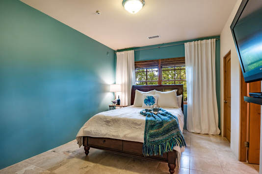 Blue/green is a soothing color for the bedroom
0 Comments

Why live with blah, boring beige walls? Grab a paint deck and head outdoors to see what glorious colors you can choose for your walls. Watch this brief video for inspiration.
2017 Pantone color of the year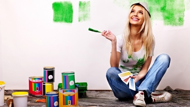 We love the color green because it is richly symbolic. First, green is the color of prosperity. I remember a well-heeled woman from Laguna Nigel CA. She came in and bought everything we had that was green. She informed me in no uncertain terms that green is the “Color of money honey, so you can’t go wrong with green in your home.” I also like green for another reason. Often times hospitals and doctors’ offices are painted in a soft green – why? It is known to have healing properties. Archangel Raphael is also associated with the color green. Color has a profound effect on our physical, emotional and mental well-being. In addition to healing and abundance, the color green activates balance, harmony, and hope. Pantone announced the 2017 color of the year. It’s a beautiful shade of green called appropriately enough, GREENERY. Bloggers are commenting on the fresh, spring like feeling with this shade of green. If you’re interested in this revitalizing bright shade, visit www.pantone.com/color-of-the-year-2017. They have suggestions as to what colors would also work with this vibrant green. Yellow green vs Blue green
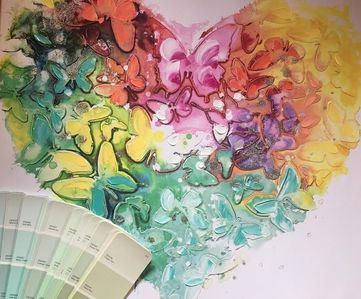
You may have already found the perfect color. Check out your Pinterest boards and play detective. Do you tend to choose the yellow-greens or the blue-toned greens? Look at your accessories.... you may have the perfect green color hiding in your favorite scarf. Look for clues in a favorite picture hanging. Play detective. Subconsciously you already know what colors are right for you.
Whatever green you choose, integrate green into your decor. Remember, in the Lord's Prayer David said, "He maketh me to lie down in GREEN pastures." Notice he didn't say grey or greige pastures. Green is good. Gives this a thumbs up and leave your comments below. Happy decorating, Alana Light  Decorating your home is as easy as A-B-C A = Always allow your authentic self to be expressed in the home. What do I mean by authentic self? It’s your true self. What is most important to you? Spending time together as a family? If so, ensure there is ample space for the family to gather & play games together. What if your authentic self loves to socialize and to have friends over? Arrange your furniture to allow meaningful conversations. Avoid the temptation to arrange furniture to only face the television – “worship the box” arrangement. In fact, if you do not have a television in your living space, you’re on trend! Elle Décor reports that tech-less living spaces are trending. Wouldn’t it be nice if we went back to a time when families actually talked to each other after dinner? What a concept! Arrange your furniture so you actually face one another. Placing another sofa opposite, or two chairs opposite the sofa will do the trick, allowing you to have a conversation with friends & family. Allow the space to support how YOU live, to support your Authentic Self. A also stands for allow only artwork and accessories that speak to YOUR spirit. If rustic farm chic does nothing for you, but antique glassware reminds you of your beloved grandmother, then display antique glassware. Or display grandmother's favorite candlesticks (pictured). If the design magazines encourage us to display some trend, only do so *if* it brings you joy. Your home is YOUR home and it must reflect what is important to YOU. 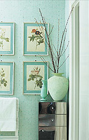 B = Ban Builders Beige. Last week I met with a great family that loves outdoor activities. Their family photos were filled with gorgeous greens and glories of nature. Yet, their walls were a sea of beige. That's where paint comes in! Painting your walls is the least expensive way to completely transform your home. A soft green – like Dunn Edwards’ Glisten Green - can warm up a room for less than $100. Or if you’re looking for a tranquil feeling in your bedroom try Behr’s Crystalline Falls or Sky Light View. You’ll feel like you’re living in a high end spa. Ban Builders Beige. If you need help choosing the right color for your space, I’m happy to help you. Contact me here. B also stands for bringing in nature's beauty. I believe every room should have a touch of nature's beauty. A gorgeous crystal geode. Cuttings from your garden. A rustic side table made out of a log. God has made such beauty. Bring a touch of nature's beauty indoors. 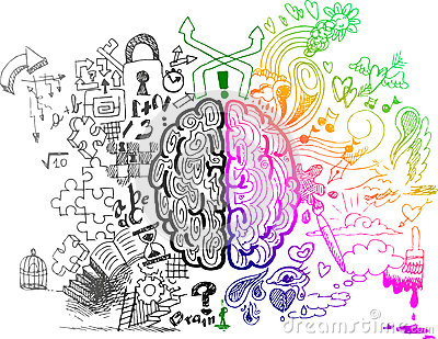 C= Creativity. Create spaces to encourage your own creativity. Whether you’re a bookkeeper or a CEO, creativity is essential to succeed in what you do. Allocate space for the hobbies and activities that bring you joy. You know the joke – when you’re only in your left brain there’s nothing right and in your right brain there’s nothing left. Set up a space to do that woodworking you so loved when you were in school. Set aside a crafting corner for creating beautiful crafts. Last year the popularity of adult coloring books soared! Why is that, do you think? When you’re being creative, you lose track of time, and you open up to the Creator of the Universe. There is something so healing when you allow your creativity to flourish. Creativity. C also stands for create cozy spaces in your home that are conducive to conversation. (Okay, I'm getting carried away with the "c" words.) Instead of ignoring your fireplace, pull up two chairs on either side of your fireplace. What a delightful place to sit and de-stress after a long day of work. Cultivate cozy spaces in all the rooms. I have a pair of chairs at the foot of my bed so we can read, or sit and chat. Very cozy spaces make your house a HOME.  Graphic source: www.DyslexieFont.com by Christian Boer A – Always allow your Authentic self to be reflected in your spaces, as well as keeping only artwork and accessories that feed your spirit.
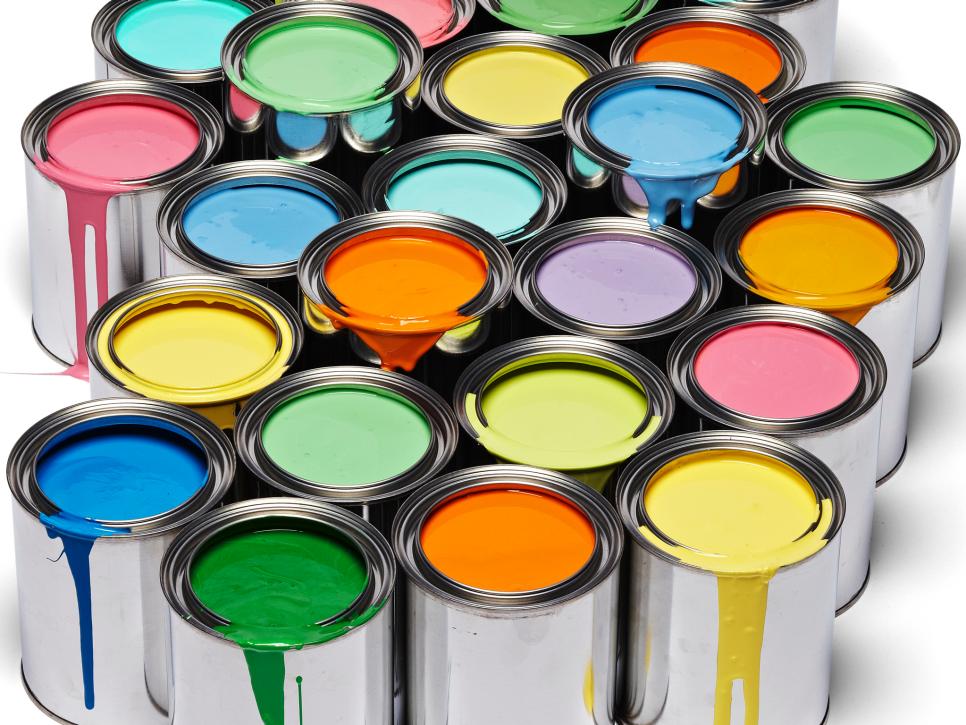
B – Ban Builders’ Beige. Bring in color and nature's beauty to warm up your home. C – Create cozy and creative spaces to allow your house to truly be a home.  If there is one thing you can do to completely transform any room, it is paint. It doesn’t cost very much, and it’s probably my #1 go-to tip when a client wants to refresh a space economically. We go off to the paint store and grab a paint card and say, "Yeah – that’s pretty good. I’ll take a gallon of that." We get home and start painting and (cue record scratch). "Oh my gosh…. What have I done?!?" Sound familiar? Dejectedly we trudge back to the paint store and reluctantly grab a gallon of boring, blah beige. We might as well stick with Arizona White. Sigh. I say, "Heck no… don’t settle for Arizona White!" Or abalone, alabaster, biscuit, china, cotton, dewdrop, early snow, fog, frosting, gauzy, hush, igloo, juniper, linen, marshmallow, mist, nuance, oyster, pearl, sand, snow, shell, wheat….etc. Yes, those are real names of blah, boring beige. Your rooms should lift your spirits, and make you happy to be there. God made so many gorgeous colors – don’t settle! A drab beige, taupe or greige, might suck the light right out of your room. But there is a trick to choosing paint colors. Here are 3 simple steps to choosing the right paint color. It’s really as easy as 1-2-3.  STEP 1 LOOK FOR CLUES: Look around the room and look for color clues. Be a detective! The right color is probably already in front of your nose. Maybe the perfect color is in a painting that you have on the wall. Maybe it’s in a throw pillow on the sofa or chair. Maybe it’s the background of that great family portrait. Wherever you find that perfect color – remember this – it’s your inspiration piece. The happiest color is already in your home – you just have to find it. Be a detective and find that inspiration piece. Look for clues in what you have already. STEP 2 CHOICES: Now that you’ve identified the color, go to the paint store and grab several paint cards that are close to the color you have in mind. Let’s say you’re looking for a soft green. Grab all the paint cards that are clear green. Then grab paint cards that are yellow-green. Go the other way and get some paint cards that are blue-green. Now you have a beautiful palette from which to choose your perfect color. Take the cards home and hold each one up to the inspiration piece you found in step #1. Some of the cards will look dirty or grungy compared to your inspiration piece. Then you know that’s not the right color. Try the next card…. If the paint card looks fabulous and looks like it came right out of your inspiration piece, then you have the right color! Most paint cards have 3 or so versions of the same color – don’t use the lightest – it’s a case of why bother. It is so pale it'll look like beige. The deepest color can be a bold choice so when in doubt go with the middle tone. 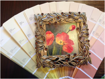 painting by Donna Burrows STEP 3 TESTING, TESTING, 1-2-3. Go back to the paint store and get a little test pot of the chosen color. I suggest you paint a 3’x3’ sample onto the wall. Maybe paint it into the corner of two adjacent walls – light changes the color on different walls…. Look around your room right now, and you’ll see what I’m talking about. The exact same color can look like 4 different shades, all due to how much natural light there is, and what is in shadow. Do you see it? After you’ve painted your 3x3 sample on the wall, live with it for a few days. I know, this requires our least favorite word – patience. Why? I want you to live with the color and see how it looks in the clear light of the beautiful morning sun. How does the color change when it’s high noon? What does the color look like at night, with your room’s artificial lighting? Something that looks great in the daytime might turn muddy depending on your lighting. A little patience in this process ensures you will love the final paint color. 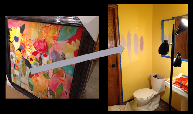 The perfect paint color is in your existing artwork. Choose which color makes your heart smile. Following this simple 3 step process will help you choose the right color for your space. You can do it! If you need a little help, then of course I’m happy to help you. I love color consultations – I have paint libraries of larger samples we can play with to help you get just the right color. But I think you can do it. And now you know how. Send me your before & after photos. I love to hear from you. ~Alana Light |
AuthorAlana Light Archives
April 2018
Categories
All


|

|
|

|